
반응형
content의 양이 적을 때 footer를 페이지 가장 아래에 고정 시키는 방법은 여러가지가 있지만 제일 좋은 방법을 알게 됐다. 바로 flex를 이용하는 방법인데 내가 아는 방법 중에는 가장 간단하고 쉽게 해결할 수가 있었다.
- html, body에 height: 100%를, body에 display: flex, flex-direction: column 속성을 넣는다.
- content 영역에 flex: 1을 주면 끝.
이렇게 하면 뷰포트 크기에 상관없이 footer가 항상 하단에 고정된다.
코드
<!DOCTYPE html>
<html lang="ko">
<head>
<meta charset="UTF-8" />
<meta http-equiv="X-UA-Compatible" content="IE=edge" />
<meta name="viewport" content="width=device-width, initial-scale=1.0" />
<title>Footer 고정</title>
</head>
<body>
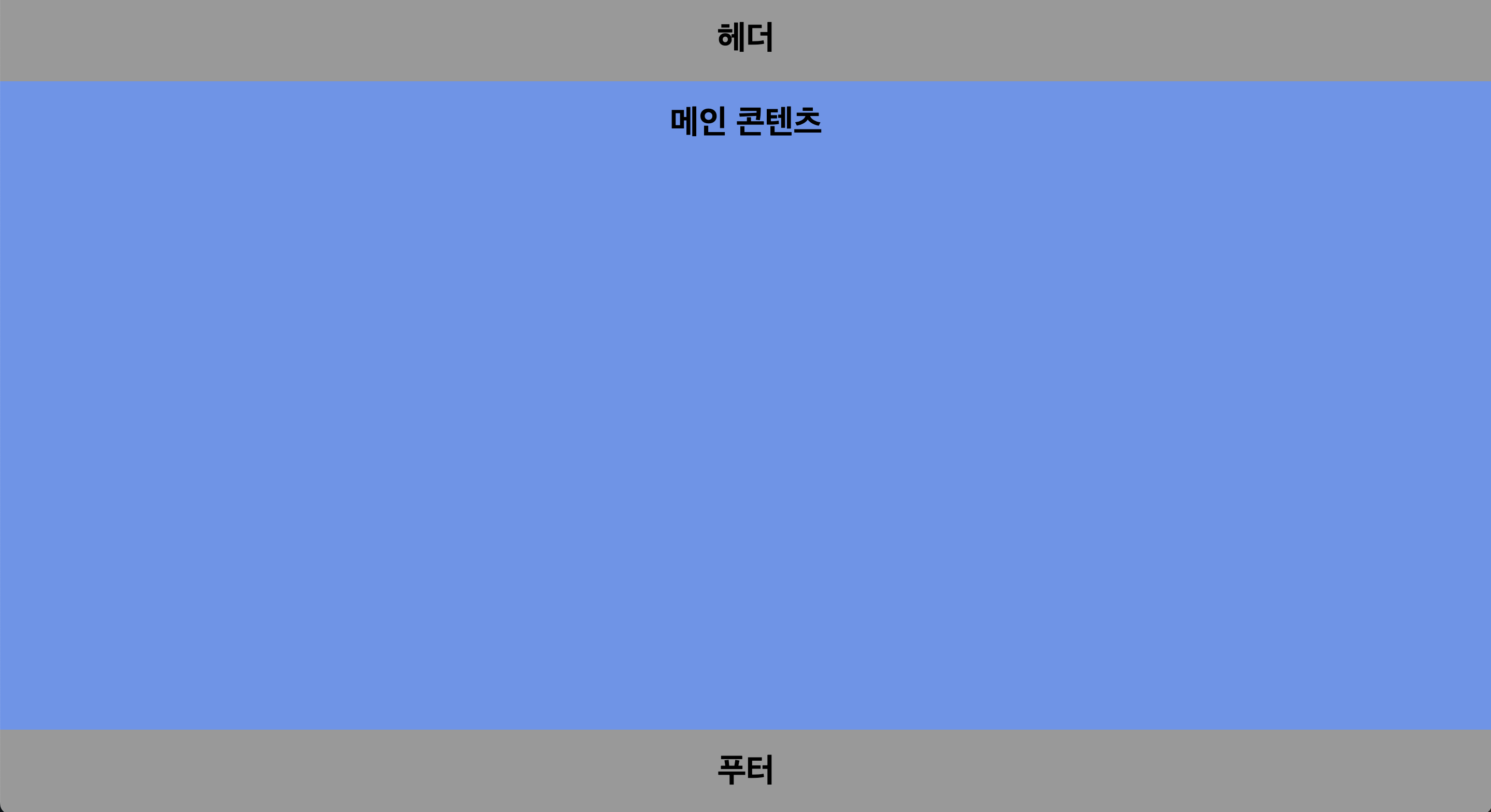
<header>
<h1>헤더</h1>
</header>
<main>
<h1>메인 콘텐츠</h1>
</main>
<footer>
<h1>푸터</h1>
</footer>
<style>
html,
body {
height: 100%;
}
body {
display: flex;
flex-direction: column;
text-align: center;
background-color: #999;
margin: 0;
}
main {
flex: 1;
background-color: cornflowerblue;
}
</style>
</body>
</html>반응형
'휴게소' 카테고리의 다른 글
| 신입 개발자인 내가 블로그 글을 쓰는 이유 (0) | 2022.04.28 |
|---|---|
| 피그마 사용법과 협업하기(개발자 시점) (8) | 2022.04.17 |
| VS Code 커서 스타일 및 애니메이션 변경하기 (0) | 2022.03.18 |
| 개발자가 알아야 할 광고 용어 모음(feat.광고 플랫폼 개발자) (2) | 2022.03.06 |
| 신입 프론트엔드 개발자 첫 프로젝트 회고 (6) | 2022.03.02 |